Mobile browsing now surpasses desktop browsing in at least ten major countries, including the U.S. and Japan. Google says that “89% of global smartphone owners make use of Google search on their handset.”
Unless you’ve been cozied up under a rock, you’ve heard about Google’s increasing focus on mobile-friendly search. Google prioritizes user experience when calculating ranking requirements. So if your site isn’t mobile-friendly, it’s probably not Google-friendly. And as more and more users go mobile, Google will continue to penalize sites that aren’t optimized for the mobile experience. Translation? If you want to get a gold star from Google – and your users – you need to get mobile-friendly.
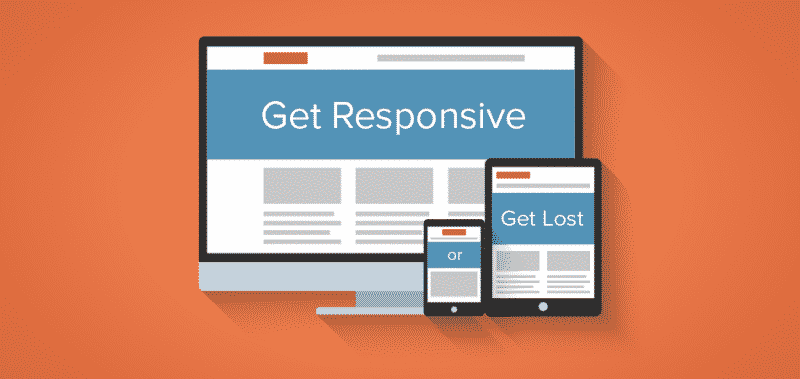
We think responsive design is the best solution to your problem. Here’s why:
It’s better for SEO.
Aside from the obvious benefit of making Google happy, responsive design helps your SEO in other ways too.
When your site is responsive, each page is a unique entity with a unique URL – meaning that your page rank won’t be diluted the way it can be if you maintain both mobile and desktop versions of your site. Having a mobile version of each page in addition to the base URL will, at best, split the traffic between your two URLs rather than driving it all to one. Generally speaking, more traffic to a URL means higher rankings –so a responsive design, which funnels all that incoming traffic to one location, is better for SEO.
It’s lower risk.
Maintaining mobile and desktop versions of your site also exposes you to the risk of releasing duplicate content, which can hurt your SEO. Responsive design, on the other hand, makes it less likely that you’ll be dinged for duplicate content and get your ranking lowered.
Maintaining two versions of your site is also a hassle, as it means you’re updating everything twice. If your web team makes a mistake during the update process, it’s likely that you’ll end up with mismatched content on the sites. Contradicting information can lead to poor user experience, poor customer experience, and ultimately, a lower bottom line.
It’s less expensive.
While you’ll initially need to put up some cash for a responsive design, it’s cheaper in the long run.
Remember what we just said about having to update both versions of your site? It’s a no-brainer that building, maintaining, and updating one site will cost you less time and money than doing so for both a mobile and base version. You’ll also avoid the cost that goes into having to set up device detection so you know where to send users.
The takeaway: we now browse, shop, work, and bank on our phones. Desktop browsing remains but it won’t be taking center stage again. It’s time for you to step into the mobile-friendly future.
Not sure if your site is mobile-friendly? Google can tell you with a quick test. Of course, we can tell you, too – and we can help you out with that sweet responsive design we just told you about.